5 ways to make your developer platform more intuitive
2023-02-02
5 ways to make your developer platform more intuitive
Hey there!
PlatformCon 2023 is live 🚀 I can’t wait to see what the community comes up with this year. Be sure to check out the call for proposals and submit your talk.
This week’s guest writer is Fernando Villaba, Sr. Tech Evangelist at Humanitec. He shares 5 tips for making your Internal Developer Platform intuitive.
Let’s get bakin’
5 ways to make your developer platform more intuitive
Fernando Villaba, Sr. Tech Evangelist at Humanitec
If you’re building an Internal Developer Platform, you want it to be safe and intuitive to learn and use. Developers should be able to use your IDP without having to read the manual first. Here are 5 tips for designing an intuitive platform:
Choose features wisely. Make your IDP simple to use and easy to navigate, with opinionated solutions that apply to your organization. In general, it is better to have a smaller number of well-designed and relevant features than a large number of incohesive features. Design your IDP to communicate as many of these features as possible intuitively while also discouraging features that can be harmful or an antipattern.
Use signifiers. Signifiers are cues – labels, icons, tooltips, and other types of visual indicators – designed to help users understand and navigate your IDP’s features. They should only be used where design cannot be intuitive in other ways. Too many signifiers can clutter the UI or CLI output and overwhelm your users. The arrows on the stove in the picture below are a great example of this – they can’t hide the overall poor design!

Leverage existing conceptual models. Choose ones that your user is already familiar with like, for example, the use of color. For example, using green for error and red success will cause unnecessary confusion.
Map features and properties. You’ll want to do this in a way that makes it easy to infer the relationship between them. Compare the stovetop below with the previous photo – this mapping is much more intuitive! For example, if a workload is the unit of deployment in your IDP, all of its properties and related features should be close to it in the UI.

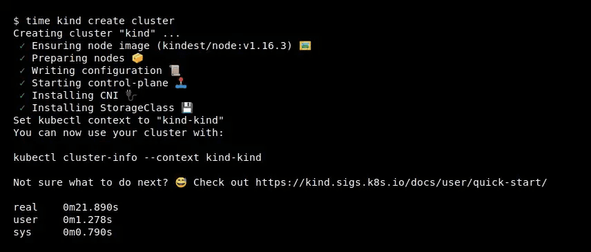
Provide feedback. Whenever a developer performs an action, your IDP should give feedback on whether that action has succeeded or failed. Make sure the feedback is useful and accurate – poor feedback can be worse than no feedback at all! Here’s an example of great feedback from Kind:

But this is just the beginning. There is so much more to designing a great user experience for your IDP. Check out the full blog I wrote on Medium. And let me know your thoughts on Twitter at @nandoyum.
Short on time? ⏳ We got you 🥐😋

🥐 PlatformCon 2023 is live! The platform engineering community is thrilled to bring back this virtual conference by and for platform engineers for its second year on June 8th/9th.

Sign up today and be the first to get updates on new speakers, opportunities to get involved, and in-person meetups. And if you’re a platform expert, leader, or practitioner, submit your talk proposal to share your insights with the community! The call for proposals is open through February 28th.
🥐 Another take on SRE vs. DevOps vs. Platform Engineering on The New Stack.
🥐 Here are 5 things to consider when introducing infrastructure automation.
🥐 Scaling enterprise-wide Kubernetes adoption can be a 🐕. Our next webinar dives into common challenges and solutions.

🥐 The DevOps is dead controversy lives on in 2023…

Have you joined the Platform Engineering Slack channel? If not, you're missing out. Here are some job opportunities recently shared by the community:
Sportec Solutions AG is looking for a Technical Product Owner
ASAPP is hiring a Senior Software Engineering Manager, Platform
And that’s a wrap on this week! As always, this newsletter is a community project, so if you have anything awesome to share from the cloud-native world, send it our way.
Stay crunchy 🥐
Luca
